The Supply Store
Back to YouCanDraw .Com
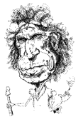
Click on any feature of the face and be
transported
instantly to that section of the book
Back
to Part I
Back
to Part II
You're at Part III
Go
to Part IV
Go
to Part V
Review:
You've seen them three times now, twice in these in-depth lessons and once in the section on Mr. Average Face: the vertical landmarks. You're going to see a very quick review next - so it really ought to be review this time. Then we'll take it a step or two farther and hopefully you'll have a working feel for how to use the vertical landmarks. I know, there's fair amount of repetition here but it's through repetition you'll really learn it. Advertisers say you need to see an ad or marketing piece seven times before it really sinks in.
Two major concepts in this section to remember: 1) the eyes are your "unit of measure" and 2) out of convention, the other major facial features are proportioned and aligned with respect to the eyes.
Proportioned in respect to the eyes meaning that in a front view the facial features are sized in terms of eye widths, e.g.: "the base of the nose is one eye width wide, the Mr. Average face at it's widest point is five eye widths wide, the eyes are one eye width apart". That's what I mean. The eye becomes the unit of measure
Aligned? What's that mean? In a nut shell, it means reviewing the three most fundamental vertical pairs of lines the nose and mouth are lined up with. Yes, we can come up with all sorts of other vertical alignments, but these are the ones we'll concern ourselves with - they're the most important and they're really all you need to concern yourself with when you're starting. And those are these:
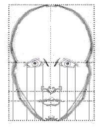
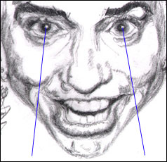
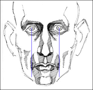
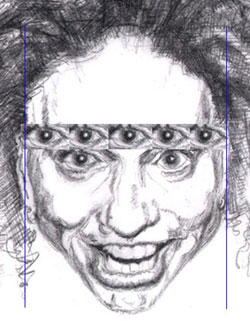
1) Here's the foundation proportion: the eyes are one eye width apart. (Which presupposes you've already established one eye as one eye width). Everything will build on this.
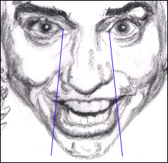
2) The pair of vertical lines that drop from the "medial canthus" you know, the inside corners of the eyes. These are the lines that drop from the inside corner of the eyes closest to the root of the nose. (The root of the nose is the part of the nose that comes out of your forehead.)
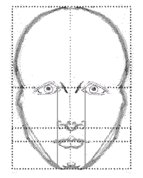
Lining up base of nose and
inside margin of eyes
On Mr. Average the width between these lines, the lines between the inside corners of the eyes, match the width of the base of the nose (the part of the nose that's just above the upper lip). This includes both nostrils. Generally speaking, the base of the nose is also the widest part of the nose. (So don't forget: it's also one eye width wide.)
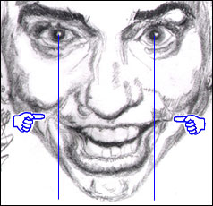
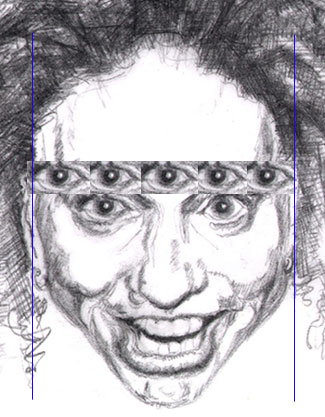
3) The lines marking the corners of the mouth should line up very nicely
with the middle of the pupil lines (though in this picture they don't touch
the line very well - the mouth is narrower - but imagine that they do :-).
And that's really it. Those are enough vertical lines to get you started.
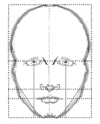
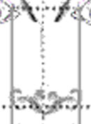
Pupil and mouth relation
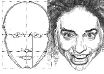
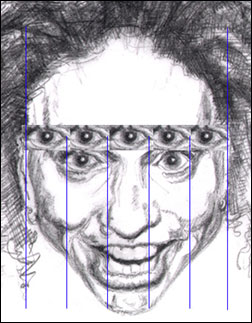
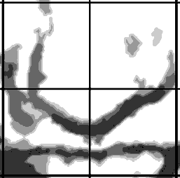
Just for fun. In this next picture just below, three pair of lines have been dropped from the eyes: from 1) the inside corners of the eyes, 2) from the middle of the pupils, and - this is new - 3) the outside corners of the eyes. The lines dropped from the outside corner of the eyes are there to help you keep things lined up as you travel down the face. There's also a pair of lines dropped from the cheeks bones.
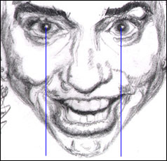
Mr. Average's vertical guides
This picture summarizes the foundational
vertical lines - plus one: the lines from the outside corners
of the eyes drawn down, over, and past the cheeks. This third line, the
outermost one is there to give you an idea how measurements using the eyes
can align with the rest of the face.
A funky phenomenon. It's easy to lose track of where the vertical lines run in these types of sketches because the diagonals lines of the jaw tend to cause an optical illusion - the brain would like to see the vertical lines lines taper or funnel together as you move down the face, but the opposite happens. Look at the area below the bottom of the nose line in the picture above and ask yourself if those lines don't appear to be splaying out as they travel to the bottom of the chin line. |
To see more Mr. Average Face dimensions, see Hefner Part II, or the Mr. Average lesson for a thorough review.
Do you notice anything else about the version of Mr. Average used here? No? Well let me ask you a more specific question: is this the old or the new Mr. Average? How do you tell old and new apart? It's the base of the nose: on the old Mr. Average, the bottom of the nose line divides the lower half of the face in half again. That is, it falls right smack dab in the middle between the middle of the eye line and the bottom of the chin line. It divides that area in half. In the new Mr. Average, the middle of the nose line is raised a small amount: up to the two fifths line - that is, if you divide up the distance between the middle of the eye line and the bottom of the chin line in to five equal parts, the bottom of the nose falls two fifths the distance down. This is review but I want you to get this :-). Ans: this is the old Mr. Average. How would you use this when looking at and proportioning a subject's face? Simple. You visualize the the middle of the nose line at the old placement first (because it's easy to judge the half way point) and then push it up a little to find the new Mr. Average bottom of the nose line. Then you judge your subject's nose to be above or below that line and exaggerate from there. |
Comparing Ani with Mr. Average
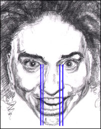
Ok. Next section. Here we're going to make a comparison. You just got done reviewing the Mr. Average Face above, now let's put him side by side with Ani. We'll be comparing the medial canthus of the eyes (the corner of the eye closest to the nose), with the the base of the nose: the widest part of the nose that's found just above the upper lip. With no help, can you decide how the base of Ani's nose might align with the same vertical lines drawn down from her own eyes? Compare back and forth now:
The base of the nose: comparing Ani to Mr. Average
Don't worry that Ani's head and face are proportionately larger than Mr. Average - that doesn't matter. You're job is to mentally visualize and locate the inner corners of her eyes, drop those lines straight down as vertically as possible, and decide if the base of Ani's nose is wider, narrower, or the same width apart as the inside corner of her eyes. And don't forget this: it's subtle!
It's those subtleties we'll exploit in caricature (or you'll want to be cognizant of them when drawing a realistic portrait). Here's an illustration where we've done this for you - i.e. dropped vertical lines from the inner corners of the eyes to the base of the nose (and then some):
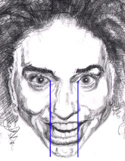
How does Ani's nose square up?
Go back up to Mr. Average and look very close at how those vertical lines contact the outside edges of the nostrils. Zero in on exactly those points. And yes, I'm being a stickler now. The kind of detail you need to start looking at at this point gets very specific and fairly minute. But you're getting so good at this! And I'm very proud of you. Consider yourself the Sherlock Holmes of art and really start sniffing for those fine details.
What's your off-the-cuff sense? Look at Ani. Look at Mr. Average. (Use the "Page Up" and "Page Down" commands on the right side of your key board.) Would you agree the base of Ani's nose - both off the cuff and by using the vertical lines - looks wider? Even if it's wider by just a portion of that vertical line? See just that little bit of nostril sticking outside those blue vertical lines? Therein lies the difference. I said it'd be subtle, didn't I? That's my conclusion anyway. I'm so sure of that I'm going to stick with it. So chalk that one up:
|
Ani's nose is proportionately
wider at the base. |
Now, I've highlighted that finding above in blue with big block letters more to break up the page than anything else, but it's highlighted also so when you get to the bottom of this page it's easy to look back and sum up all of your discoveries specific to Ani. Again the general concept to be aware of here is vertical alignment, and vertical alignment in terms of eye widths.
Applying the" inner corner
of the eye lines" to Ani
Let's make another comparison
While we're at it let's make another comparison here. When you look at both Ani's and Mr. Average's noses together, how do they differ? We're concerned here with vertical alignment, which also takes into account widths of the features as much as anything else.
| (In Part I, we were looking at the horizontal guidelines which are a really a gauge for vertical distribution of the features. Here, in Part III, we're concerned with the vertical guides and landmarks - a gauge for the horizontal distribution and dimension of the features - yes it can get confusing.) |
Looking a little closer at Ani's nose, how does the tip, the bulbous tip, of her nose compare in width to the not-so-bulbous tip of Mr. Average's? (There was a hint of the answer in that last italicized word.) Look at Mr. Average's for a second:
|
|
How
does the tip of Ani's nose, that is, the bulbous tip of
Ani's nose.... |
|
In Part IV we'll look much closer at each important feature and shape. Right now we're zeroing in on proportions and relations by using our landmarks. Let's compare that to Ani's right now:
Pointing out the bulbous tip of the Ani's nose
Something of a difference wouldn't you say? The tip of Ani's nose has significantly more mass to it than Mr. Average's. Let's do another comparison - just to keep you on your toes. Look at the next picture. Vertical lines have been applied to the outermost part of the tip of Ani's nose (they're inside the other pair of lines). Not to worry, theses aren't any lines you need to be concerned with yet. I only want you to be aware of how those outside borders of the bulbous tip of Ani's nose line up with the rest of her facial features both directly above and directly below her nose - just for the sake of going through the motions.
Sizing up the Bulbous tip of the nose
(and yes, the nostril on your
right is bigger)
When you're drawing an actual picture, you always want to be relating the part you're drawing with the parts around it. (Again "parts" mean other facial features, lines, shadow shapes, positive forms, etc.) It's that jigsaw puzzle effect. (see Lesson 4.)
After looking at enough different aspects of a persons face, relating them to both the horizontal guides (like you saw in Part I) and now vertical guides here in Parts II and III, you should start seeing every face with an imaginary grid pattern applied. And you'll be seeing this grid soon enough - that tic-tac-toe looking thing we arrive at when we combine all of our most important lines. And in time, I hope you'll have it internalized. Back to our subject, specifically the tip of Ani's nose, we've now seen...
|
the tip of Ani's nose is pretty big |
Next: sizing up the corners of the mouth
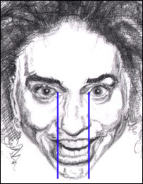
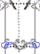
Let's go to the next vertical guideline: the corner of the mouth / middle of the pupil line. Like you saw above, this next guide is drawn from the center of the pupils straight down to the corners of the mouth.
Dropping "plumb lines" from the
middle of the pupils to the
corners of the mouth
Use your reckoning powers. How do these lines - these lines drawn straight down vertically from the middle of the pupils - align with the corners of the mouth? It's slightly subtle, but wouldn't you say they drop inside the corners of the mouth? I'd say so. This is really another way of saying Ani's mouth is wider than the Mr. Average mouth width. Correct? Correct. If it isn't perfectly clear what I'm calling the corners of the mouth, I'll make it perfectly clear in this next picture:
Pointing out the corners of Ani's
mouth - they're wider than
the "plumb lines"
Not as subtle as the width of the base of the nose alignment with the inner corners of the eyes above, but you can still see it does take some snooping, some "Sherlocking" around to perceive it. The corners of the mouth - in this picture - are more akin to fine lines than gaping mouth but are "mouth" none the less. They'll suggest what kind of bony structure lies underneath. And the bony structure is the structure on which the rest of the face is built. (A wide maxilla, the bone behind the upper half of the mouth, makes for a wide grin and a wide mouth.) Back to the chase. You can actually measure all these widths with a ruler and you'll see what you saw intuitively - that...
|
Ani's mouth is wider
than Mr. Average's. |
Summary. That's really the jist of the main vertical guide lines: those three measurements. What are those three measurements? Let's run through them again. They're the three measurements whose function is to see if your subject's features (in this case Ani's), coincide with these Mr. Average dimensions:
-
that the eyes are one eye width apart;
-
that the base of the nose is one eye width wide (i.e., that it falls within the two lines dropped vertically down from the inside corners of the eyes);
-
that the farthest corners of the mouth line up with the middle of the pupils - which makes the mouth two eye widths wide. (And how do we get two eye widths? Here's the math: one eye width between the eyes, 1/2* eye width from the left eye, 1/2 eye width from the right eye. Add 'em up and we got a total of two eye widths. *We get 1/2 eye width because we're measuring from the center of the pupil - which should be at the center of the eye.)
And if they don't align, if they're not just like Mr. Average in proportion, it's time to ask how are they different: Are these measurements larger or smaller? wider, narrower? How your subject is different will point out what you'll exaggerate. Concerning Ani, we've seen thus far here in Part III that Ani's nose is wider than that of Mr. Average's, the tip of her nose is sizable, and her mouth is wider than that of Mr. Average's.
| Q: Why just these three measurements? Ans: Because the eyes, the nose and the mouth form the nexus of the facial features. When we talk to each other our main focus is on the eyes and the mouth. We actually look at the nose quite rarely unless there's something unusual about it. It's our built in "Mr. Average meter" at work - and it doesn't turn on unless it's presented with something unusual. (I have an acquaintance who's nose wrinkles in very unusual ways when she talks. I just can't keep my eye's off it...I get all cross eyed and miss most of the conversation.) |
Lining up the vertical landmarks apropos
to Ani's actual features
Let's now do for Ani what we did back in the Hefner example. Let's bend those vertical landmarks to fit Ani. Let's stretch 'em out and see if we can't get a "feel" for the kinds of angles they generate away from the Mr. Average vertical. (Recall, these lines are perfectly vertical on Mr. Average.)
Strengthen your powers of observation
This isn't to mine out any information we're going to just drop in an equation to pop out a convenient prescription for how much to exaggerate. Rather it's just another exercise you can do to strengthen your powers of observation. The more you exercise your reckoning skills and the more you're reminded to do it, the more you'll do it - and you'll reap the benefits in the form of fearlessness and confidence.
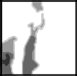
Picture 1: Inner corner of eyes to the widest part of
nose
In this first picture you can see the adjusted lines drawn
to fit Ani's dimensions. They're drawn from the inner corner of the eye
(the medial canthus), to the outside
margin of the
nose - which is more or less at the level of the base of the nose. Yes it's a rough, but you
get the idea. Take a look:
Drawing lines from the inner corners
of Ani's eyes to the base of her
nose - and beyond
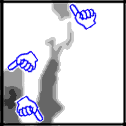
Picture 2: Center of pupils to far corners of the
mouth
Secondly, you can see this pair of lines (which of course are
vertical on the
Mr. Average face), drawn to fit Ani. They fan out in an expanding funnel
from the center of her pupils to the corners of her mouth. What's this tell
you? It tells you can draw her with a big mouth. Not how much
bigger or anything like that, but that you now have a logic for giving her
one. ( A logic that'll support you when drawing any face.) Take a
look:
Drawing lines from the middle of Ani's
pupils to the corners of her mouth
Picture 3: Which do we exaggerate more?
Now this is the insightful comparison. Let's combine the lines from the above two reckonings we just did above and see if they give us any more exaggeration clues:

Combining the guidelines to see if they
give us any clues about how much
we can exaggerate
What we're trying to glean from this picture is this: can we exaggerate the mouth more than the nose or vice versa and come out with a good caricature?
Again, we're not trying to put any actual numbers to this,
though you could. More accurately it's a kind of
visual "sizing-up". It's a search for real evidence to see
if there's any logic behind our gut feeling that her mouth ought to be
drawn bigger than her nose. I have an intuition - maybe it's just
something lingering from an impression - that first impression that her mouth is more dominant than
her nose. When I think back I remember my eyes were pulled more to her mouth than to her
nose.
It's all about the mouth
|
I said this above - I'll repeat it. You can concentrate more on the mouth because we look at the mouth more than we look at the nose. Unless of course the person has a very notable nose. But we look at the nose more than we look at say, the forehead. |
 |
Here's another thing you can toss into your "exaggeration meter", and I've said this numerous times too (repeated often in the Archives): you can always chop off the forehead in a drawing, add hair and have an instant caricature. Why? Because the forehead is fairly expendable in the process of recognition.
Why bring this up again? Because in the final analysis, when
everything else is equal, if you're at a grid lock about what to
exaggerate you might put more weight on making the mouth a whole
gang larger - and your drawing will be both more recognizable and
funny. Said a little differently, people will recognize a person's
mouth more readily than they will the nose. (Because, I've said this like
twenty times now, people look at the mouth more than they do the
nose.)
Let's throw a wrench in the whole program
Now, some caricaturist's have hilarious results doing just the opposite: making the nose, specifically the nose, proportionally HUGE even when in reality it's relatively hardly worth mentioning. The brain still recognizes the nose as the "correct" nose if the drawn nose truly resembles the person's real nose. And if even if we don't consciously notice the subject's nose.
Contrast and humor
| What throws your brain's recognition center off kilter is the pure size and disproportion of a gigantically drawn nose. Or grossly exaggerating any one feature. Why's it funny? It's a bit of a shock - and we laugh. It's just like in comedy: where we find huge contrasts we find humor. |  |
Dean Martin's straight character contrasted with Jerry Lewis's antics makes us laugh. Somebody switching from dead seriousness one second, to tears, to hysterical laughter, then back to dead-pan seriousness over the next five seconds leaves us laughing too. Again, it's contrast.
And isn't that the point of caricaturing? Getting at least a little
lift if not a laugh from a drawing? In a movie, a humorous still scene
is called a "sight gag". Seems to me
caricatures hit the same funny bone.
You can exaggerate anything you want
| Yes you can exaggerate any feature when caricaturing but
it seems to me, what's needed to really nail the caricature, to really squeeze the
biggest bang out of a drawing is to discover the one, or two,
or three things
that make a face truly recognizable and run with it from there. I remember back in the days of George Bush's early presidency everyone drew him with emphasis on different features. But by the end of his tenure, the "George Bush" formula had been unearthed: every artist and cartoonist included three things: an asymmetric snarly mouth, a jutting chin and a tall forehead. Every single one of them. |
|
Back to the task
 |
So what does picture 3 above reveal? To me, it says since the lines seem to open just a little more rapidly when traveling from center of the pupils to the corners of the mouth (more obvious on the right side of the picture), than from the inner corners of the eyes to the base of the nose, then the mouth should be given more gravity. |
That is, it should be made more obvious, bigger, be more exaggerated in a caricature. Enough said. Here's picture number three again:
Notice how the lines widen more going
from middle of pupils to the corners of
the mouth versus inside corner of the
eyes to the base of the nose
*
It's a feel thing again. But as I try to explain it, as I go through the process of trying to explain it, by observing myself in the act of drawing I'm learning that I do most if not all of these little steps at some level or another, consciously or unconsciously. It's a discovery thing for me as much as it is arriving at a method. However, to arrive at your own gestalt and your own style, (because they come in sudden leaps of understanding), you need to develop a method. And that again, is what we're trying to accomplish here - build a method you can build on top of. |
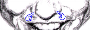
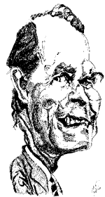
Just as a reminder, when sighting around the mouth, and
in particular when you're aligning the eyes and the corners of the mouth, don't forget the mouth and the lips are set within the cylinder of the maxilla / lower jaw and teeth. You can see this a
little better in this scary long-faced, Star Trekky looking guy here:
Don't forget the mouth lies over a
cylinder-shaped foundation
Also notice how the mouth and it's farthest corners seem so much narrower than the middle of the pupils...
 Close-up of the mouth corner |
...Yet if you look close, you'll see different: you can see that the the corner of the mouth - the very last few millimeters of the horizontal line of the mouth, it's shared edge - on the left side of the picture - is actually wider than the center of the pupil on that side. It sure looks narrower, doesn't it? But drop those plumb lines and let the truth be known. |
|
And while you're at it you might want to check to make sure the two vertical lines are straight lines (they are), and that they're also the same distance apart at both top and bottom. Drawing this scary guy
The second question: "how do all of his features align with the major horizontal and vertical guides and landmarks? Will anything there change what I've already decided about Mr. Trekky's overall long-faced look?" Probably not. More likely, they'll support everything we sensed about what to exaggerate. |
Lets' do one last thing before we go to the next section. We used this demonstration back in Part II. (If you go there, use your browser's "back" button to come right back here.) Using a horizontal pencil we scanned our way up and down the picture. Let's look at how you can use a pencil for aligning and sighting the actual features vertically. Not to worry, you can substitute anything for the pencil - a ruler, the side of a book, in time your own built-in vertical scan line. Hopefully this will tie together what we've done so far.
Check out this Animation to see the vertical landmarks used in a virtual "real time" example |
What should you get out of the animation? Read this:
What you're suppose to get out of the animation is this: you're sighting down your arm, you're looking at Ani's face and comparing it to a vertical reference (the pencil); you're trying to visualize Ani's face and compare by memory how her features ought to line up against the vertical landmarks and guides of Mr. Average. You're making those comparisons and relationships exactly the same way an artist does them.
In the next animation, (in the "unit of measurement" section just below), you're going to see how to add still another layer of reference, another layer of accuracy to your sightings. You see, at this stage, if you've worked your way through all the lessons, done all the exercises, this hopefully will really start to make sense to you. You're up to the task! (Remember to look up Lesson 8--- if you're' unclear about what "sighting" is - look towards the bottom of the page.)
Adding one more layer of accuracy
Ok, you've looked at the horizontal landmarks of the face, you've just seen the vertical guides and landmarks. They're there to reckon the rough overall relations of the features and their correlation to each other. In the very next section, you'll review how to gain accuracy in your reckonings using "units of measure".
| Way back in Part I we looked at the overall shape of Ani's head (towards the top of the page). If you drew a rectangle around her head, you could see the rectangle would be taller than it was wide. But how much taller than wide? You'll have ample ammunition to figure that out after you get through the next section on applying "unit's of measure". Just use the same kinds of "sightings" when you approach reckoning the dimensions of the head or any large object. (You may want to use a different unit of measure - something bigger than the eyes.) |
Using the eye as the 'unit of measure'
The Mr. Average sketch below will help us segue back to something we talked about before: unit's of measurement. And more specifically lets look again at using the eye width as the particular unit of measure for performing sightings on the face.
Earlier in the book, might you recall using something, anything in a picture as a basis of comparison? A unit of measure? (If not go check out Lesson 8, Part VII to review specifically units of measure (look towards the bottom of the page), and Lesson 8, Part VI, for relating length and width - something that'll be useful here shortly.) We'll now apply that idea to the face.
Let's look at the other facial dimensions using the eye as the unit of measure. Then we'll review the face in terms of vertical comparisons, and lastly, you get to do a drawing yourself where you'll review grids, highlights and shadows and do your very own drawing of Ms. DiFranco. Does that sound like fun or what?
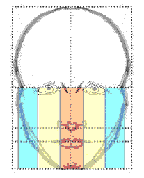
Vertical columns of Mr. Average
You've seen this picture above (the one with the lightly
colored columns drawn over the Mr. Average face), many times by now. What's
it represent? It shows the face in terms of eye widths - forming
five columns for each of the five eye widths. You're seeing this again
because we're going to stretch a little of what we've learned earlier and
apply it to more than just the five columns: we'll use the eye as an
actual basis of measure in the next short animation. But first...
You can see that Ani's face is about
five eye widths wide too
Making 5 columns each one eye-width wide over Ani's
face
You could drop the same columns down from each of the eyes
in the above picture of Ani and approximate those columns, those lanes. Is this
something necessary? Do you have to do this? No. But it's still
another way to get you
to start looking at and creating relationships between one part of a picture with
another in a slightly different way. The eye is a pretty logical "unit of measure" as
you've been witness to in this section. The five columns are there to
just give you an idea of how the eye - used as a unit of measure - might
look if we dropped plumb lines off each eye width and extended them down
the entire face like you'll see in the very next picture:
Extending "plumb lines" off each eye
You don't have to use the eye as just a horizontal measure. That is, you don't have to keep it horizontal when you make your measurements. You can twist it around, rotate it, make all sorts of relations with it. Let's use this next animation to get ourselves reacquainted with the idea of sighting using a unit of measure we've found somewhere in the subject we're drawing (the eye in this case). And hopefully this concept of "sighting" will be much clearer after the animation. It's a good quick review.
|
Let's take a quick look at how you can use a "unit of measure" to help size up a picture. Click for Ani's sighting animation |
Getting down to the nitty gritty again: a mini quiz
As you can see Ani's face is about five eyes wide. Note however how the second eye and the fourth eye (the same eyes no matter which direction you count in), aren't exactly aligned with the two real eyes? That could mean a few things: the eye's I've clipped are a little smaller than Ani's or Ani's real eyes are farther apart than one eye width, or I just clipped them a little weird. That's just another exercise in observation. The take home message is twofold:
-
by old Greek and Roman standards, the face is generally five eye widths wide.
-
keeping you constantly observant of such little things is the key to great drawing.
Work your way through each eye width,
visualize an imaginary "plumb" line and
ask "how does everything line up?"
Time to take a reading break - and do some drawing
I'm going to challenge you now. I've been boring you to death with all this text. Now it's time to wake you back up. We need to get you drawing! So, below are some pretty simple, but insightful exercises. For each drawing you'll do, there's two pictures: one of Ani with a grid laid over her face, then a second with just a grid.
The grid you'll be using in the first part of the homework is not the grid we've been using above - but the principle's the same. These exercises will start you back at the basic foundation exercise approaches - they'll lull you right back into R-mode. Every part is linked to a page with a full 8 and 1/2 by 11 inch picture. Print out each part and dive in.
|
Homework |
You're going to do four drawings now. Yep, you're going to actually 'get back on it' and draw :-). Your first drawing will be one of Ani using a plain old checkerboard grid:
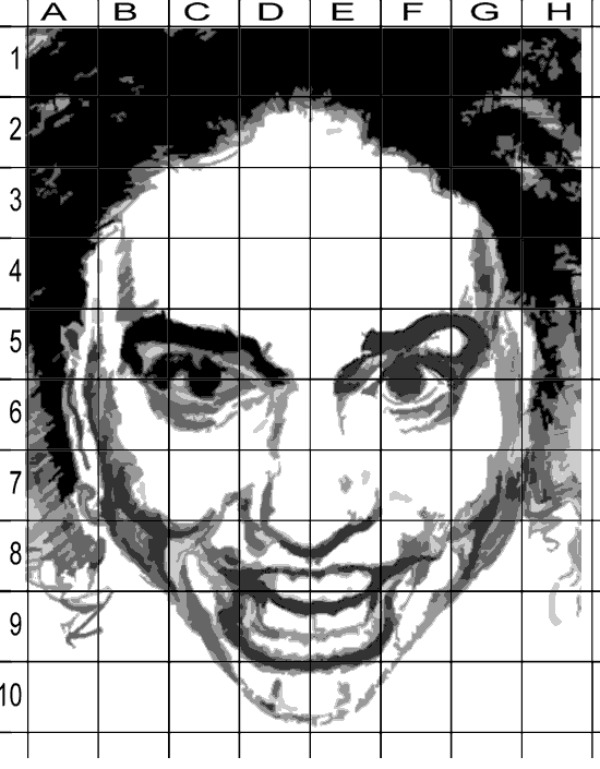
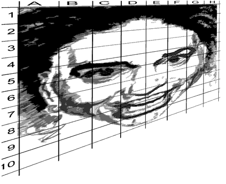
Ani seen through a grid
Step one: start by printing out this next picture - it's a four tone picture of the pencil drawing of Ani. A grid pattern has been applied to it. Click here for the picture of Ani.
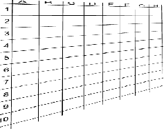
Step two: print out this second picture: it's the same grid pattern that's been placed over Ani's face, positioned in exactly the same place but without Ani's face. Click here for the empty grid. Make sure you print it out - and make as many copies as you like!
Note: it's possible these pictures will print out as different
sizes on different printers. Ideal would be a full 8 and 1/2 by 11 inch
picture on each page. They'll probably print smaller than that. If you
want a larger size, you could enlarge them on a copier.
How to proceed
This is an extension of Lesson
9: Light and Shadow. The same things you learned about there: line,
proportion, perspective, negative space, positive form, light and shadow (which
was really a synthesis of all the foundation lessons), are entirely applicable
here. Check out Lesson 9
for review.)
Tic-tac-toe
By observing either your printed out copy or by referring to Ani's gridded face on your computer screen, work your way one square at a time through the picture - just like tic-tac-toe. Treat each square of the grid as it's own stand alone format, it's own framed-in mini composition that contributes it's share to the overall illustration. For instance...
Here's a fairly complicated section of the area around the nose and mouth. It corresponds to the grid cells D7, D8, E7, and E8. (Look at the big gridded the picture of Ani) In effect there's four mini-compositions there. Take a look:
A section of the grid isolating the
nose and part of the upper lip
(squares D7,D8, E7,E8)
| A closer look |
Let's go through just one of the cells and work our way through it. Recall everything you've learned. Look at 'D7'. Find it on the main illustration. Ask yourself these kinds of questions:
-
What are the most dominant shapes in grid cell D7?
Here they are!
-
If I squint, does that help define the dominant shapes? (Go ahead and squint until you see the dark forms as one color shapes).
The dominant shapes by the way, are the shadow shapes along side the bulbous portion of the nose and the shadow at the juncture of the nostril, the fleshy part cheek and the apron of the upper lip. There are shapes within the shapes defined by different shades of gray. Squint to collapse all the different shapes-within-shapes into one.
-
Where do these shapes intersect the lower horizontal line? The upper horizontal; line? Where do they cross the or intersect the vertical lines? Check them out (the pointer fingers shows that intersection of only one side of the shape - you get to figure out the other side) :
-
And at what angle do they, the lines and shapes cross or intersect the vertical and horizontal lines? (remember you're asking yourself these questions);
-
Can I draw or perceive the shadow shapes as outlines first? Maybe that'll make it clearer how they enter and leave each cell.
-
If I just look at the outer outline of the shapes can I see those outlines as shared edges between the shadow shapes and the white areas? (Here's an outline drawing of all four grid cells - I've taken the gray out of them). Can you find D7?)
All the black has been removed from this
illustration - only the edges are left
-
Where do these lines leave one grid square and enter another? And at what angle?
-
And how do these lines progress as I go from grid to grid?
Here the grid has been re-applied (though
it's a little fatter than before)
Getting the idea? All of this should be pulling you right back into R-mode. Then go from grid to grid asking the same questions. There's' a limited number of grids, so you will work your way through them rapidly and I'll bet you find this a very pleasurable passage of time. Plus you'll have a pretty professional looking drawing when you're done. What a deal!
Now go ahead and draw. You can do it - you can draw! (Get it? "YouCanDraw". I just had to put that plug in there.) Draw the outline of the shapes first, then fill them in. Go for it - you can do it! Remember you can flip all the pictures upside down if you feel like you're getting stuck. (Remember Lesson 3 on upside down drawing?) When you're done I'll bet it looks pretty dang close to the original. You just might amaze yourself. :-)
| Last steps - the really fun ones |
Finished? Awesome. Now, if you've been wrestling with this whole idea of caricaturing, I'm going to start you off on one right now. How are we going to do this? Simple. You just follow the exact same steps you just went through but now you'll be drawing them into the distorted grids below. Try and guess how the lines ought to curve, bend, and distort as you work your way through the grid. Use the original pictures (with the face behind the grid), to gauge where lines enter and leave each grid cell. Try it a few times - you'll get the hang of it. This is usually a blast. Enjoy.
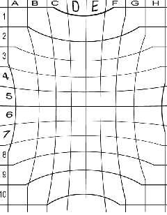
1) Here's distorted 'picture number one'. It's a fish-eye view. It really looks like a caricature, doesn't it? (And it still resembles the subject):
Distorted picture number one
Ask all those questions you've been trained to ask: "what angle does this line intersect the vertical line of the grid? At what angles do the lines intersect each grid cell? Etc. Do just like you just did. Fill no more or no less information in each grid - you'll have to stretch Ani to fit the new grid, you'll have to pay special attention to the way lines and shapes curve and arc though each grid. And you know what? You've now drawn your first caricature. Yeehaa!
-
Click here for a full sized version you can print out and use for drawing into the fish eye grid - which you can see in the next illustration...
Here's a sample of the fish-eye grid you'll be drawing the fish-eye
distortion of Ani from above into:
Fish-eye grid
-
Click here to get to the printable, matching fish eye grid. You can draw the fish-eye view of Ani right into the grid.
2) Next, you'll be drawing this crazy looking version - a kind of implosion. What's really remarkable to me is how much this distortion of the exact same starting illustration of Ani DiFranco ends up looking like former Saturday Night Live Star Gilda Radner. Does it strike you that way? Click here to compare some world wide web shots of Gilda.
Starting to look like Gilda Radner,
bless her heart
-
Click here to see and print out the full size "imploded" picture of Ani so you can draw it into the imploded grid pattern...and, drum roll please...here's the "shrunken" grid pattern:
-
Click here to see and print out the full size imploded grid.
And last but not least, let's really stretch your imagination by stretching Ani horizontally like this:
S - t - r - e - t - c - h !
-
Click here to see and print out the full size version of the stretched version of Ani. (It's turned on it's side so it'll print out of your computer correctly.)
 |
|
Ready for one last assignment? - Applying the vertical and horizontal landmarks and guides
Now take your distorted picture and apply all the vertical and horizontal landmarks and see if you can't reason and intuit your way through still another gyration of exaggeration. By that I mean go through the same steps we've been beating to death here using the horizontal and vertical landmarks / guides. Ask all the same questions you've been shown to ask (e.g. "are the corners of the subject's mouth wider/narrower than the middle of the pupils? Is the base of the nose at the '2/5ths' line?" etc.). Now go for it!!
Other things you can try
-
Make your own bizarre grid pattern. Make sure you use the same number of vertical and horizontal lines as in the picture you're drawing from. Draw / fill each small square as you've been doing but adjusted to your new bizarre grid.
-
Enlarge and shrink both pictures and grids on a copy machine. Then cut up the grid square by square. Re-compose a picture using a mixture of grids from different sized drawings.
-
Print out the exaggerated grid and draw in Ani again but draw each square from the original, undistorted picture.
-
Lastly, take a step back and ask yourself "how do the horizontal and vertical guides / landmarks fall on the your distorted (i.e. caricatured) Ani DiFranco portrait?
Side topic: Gender Differences
Before we go to the next section on looking at Ani's actual features one by one, I'd like to just touch very quickly on some general gender differences. Yes, it'll be a break from a lot of the very logical, left brain sounding (but still very right brain) stuff you so stridently worked your way through above.
The truth? Gender differences in the facial features
In this picture, Ani's real eye's are farther apart than one eye width. Just barely, but they are (we're counting an eye width as the widest part of the eye - the actual globe you see exposed from under the eyelid.)
Ok to draw women's eyes larger and
slightly wider spaced than normal
- it works!
Making this measurement can be a little arbitrary - and especially so when drawing women. Why's
that? Women generally seem to have proportionately larger eyes. Makeup's
another issue. Makeup supposed to bring your attention to the eyes, they're
the first feature we look at when we look at someone - at least in western
culture.
Making the eye's larger in women
Which brings us to an interesting and some what conflicting axiom in portrait and caricature: women are usually given larger than normal eyes in caricatures and in pictures regardless of the actual size of their eyes.
Attraction Theory
People who study Attraction Theory (several links at the the bottom of this web link), have discovered that large eyes are both more interesting and have an endearing effect on most people.
|
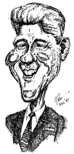
In fact, in the 2000 elections I recall seeing a TV showed where they showed Bill Clinton's P.R. team making his eyes larger than real life - the graphic artist touched them up in Photoshop. Why? Because tests showed the larger-eyed version was perceived as more attractive than the realistic Bill Clinton photo and scored a significantly stronger pull in popularity tests. That's a fact! Proportionally babies and children have large, well spaced eyes as well - supposedly making them cuter and more attractive. They sure look that way to me. Most of 'em anyway. :-) |
 |
Make-up and larger appearing eyes
Now I don't know anything about make-up but I could guess that make-up has something to do with making the eyes larger and more appealing. But I'm way out of my area of expertise on this one.
Back to Ani
So according to attraction theory the wider set eyes could
add
bonus points to Ani's total attraction quotient. We'll see more in the upcoming
caricatures.
Jump ahead to Part IV
Well, I've said about as much as I want to about the vertical landmarks. As I've said before, the vertical and horizontal landmarks help you to zero in on relations within any face you're trying to size up and draw. In Part IV, you're going to see for a third and last time an in-depth exploration of each feature: comparing and contrasting each feature's details with that of Mr. Average and with other drawings.
The idea: getting you to look deep, to observe, to perceive even the most minute detail. Why do this again? Because when you learn to look for a certain deep level of detail, you'll know such a level is possible, and you'll see things because you know they're there - things you may never have had seen before. Ready to go to Part IV? Or would you rather take a quick "day tour" into a few of the male/female facial differences? Just keep right on going down the page if you prefer the latter.
Back
to Part I
Back
to Part II
You're at Part III
Go
to Part IV
Go
to Part V
General groupings of male / female
differences in the facial features
Without going into a heck of a lot of depth, let me just
outline some of the major differences in facial features between men and
women. Note it's not an all inclusive list - men can have feminine
features and women masculine ones and still be very attractive.
Short list of Male versus female facial differences
And in no particular order...and nothing written in stone, these are
only tendencies:
-
Women: eyelids - more space between upper eyelid and the eyebrows in the female:
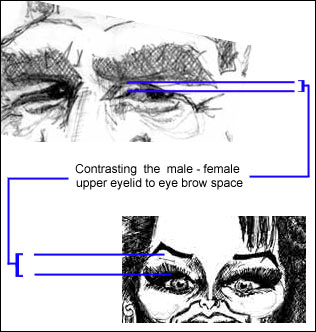
-
Men's eyebrows tend to be lower on the brow bone and tend to be thicker than women's
-
The male brow bone tends to be bonier
-
Women tend to have a higher, more vertical forehead - men tend to have a more back-angled forehead than women. (And it's often set on a bonier brow: Cro-Magnon like).
-
Men - especially Caucasian men - have larger ears than
do women. (Incidentally, all ears trend to continue to grow until you die. )
Caucasians males take the title
for the largest ears
-
Eyes look appear larger and slightly wider spaced in the female (like Betty Davis); in fact women's eyes are generally the same size as men's while their skull is 8-10% smaller - therefore about 15% larger proportionately ;
-
Women's eyes tend to be more "cat-like" at their outer edges (on the temple side of the eyes); Click here for a web shot of Cat Woman)
-
The female base of nose is set higher; less bony projection of the entire spine of the nose than the male (so give women lighter shadowing along side the nose than men)
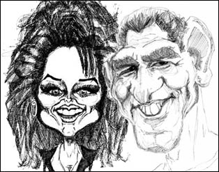
You can see all the listed male - female
differences in this comparison (The male
model is my brother Tony)
-
Female cheekbones set higher and proportionately broader, rounder, fuller.
-
Women have fuller lips then men. Of course, in time, the gradual pull of gravity rolls the upper lip almost out of sight in many people - which a face lift undoes. For a while.
-
Women in general have a smaller chin tucked under a fuller, poutier lower lip and a generally rounder lower lip. (At least, this is what is suggested in attraction theory as more desirable.)
-
Men tend to have a stronger, wider jaw, a more jutting chin. (That just made me think of the old cartoon character Dudley Do-Right of the Royal Canadian Mounted Police. - He had this huge jutting jaw and chin.
More on Attraction Theory and the
"Ideal" or
"Perfect Face"
Ideal female versus more nebulous ideal male - and this brings up why it's not considered "nice" or good form to wickedly caricature a women: there's so much more pressure on women to fit the the "Ideal female" physical model than there is on men to fulfill the "Ideal Male" model. It's a different standard. Maybe even a double standard?
What makes men more attractive? According to polls: money, power, prestige. Looks not as nearly as heavily weighed. Honest to god. (Is that anything new?)
Is this relevant to what we're trying to accomplish here? I don't know. It is an interesting question since in any discussion about looks, attractiveness, and sex appeal is always followed consciously or unconsciously with the self-directed question "how do I stack up?" It becomes more relevant and almost a philosophical question when you start thinking about Mr. and Mrs. Average versus Mr. / Mrs. Ideal - since they both might be the same person. When you push the question, you'll see what I mean.
So yes, it's pretty much a truism and a rule of etiquette in caricature that you go lightly when caricaturing women - not because women are more sensitive but more that modern culture, probably more accurate to say especially pop culture - is so looks obsessed.
Here's some interesting books - just an offshoot if you're interested. I haven't read any but have heard that they are interesting. The Etcoff book ("Survival of the Prettiest") actually comes up with ratios of female hip to waist size that supposedly ignites men to mate and also proposes dimensions of the "perfect female face" that men are universally attracted to. (Again, there's no such counterpart fro women in men.)
Discovery Channel Show
I saw a Discovery Channel show where they showed Dr. Etcoff's "Perfect Face" and how they arrive at it (a web experiment). What I found extremely interesting was that they brush aside all the little subtleties that I think makes each face unique - and the ones we painstakingly try to teach you to recognize here. The Etcoff "Perfect Face" (who she says Halle Berry is a lucky owner), is based heavily on Symmetry.
With the features of all faces being so close together in dimension, the placement and symmetry of faces being within millimeters of each other, I think they jump to some pretty big conclusions. (They did an internet study...which certainly biased by who's on the internet these days). It's a fascinating subject, a painful subject for some, and there's both compelling and laughable arguments made. Enough. Here's some links if you want to pursue this:
The Face of Love:
Feminism and the Beauty Question:
http://www.amazon.com/exec/obidos/ASIN/
Beauty Secrets :
Women and the Politics of Appearance
by Wendy
Chapkis
Survival of the Prettiest : The
Science of Beauty
by Nancy
L. Etcoff
The Evolution of Desire :
Strategies of Human Mating
by David
M. Buss
The Face of Love: Feminism and the Beauty Question
Click here to read about and seee the ideal face
Back
to Part I
Back
to Part II
You're at Part III
Go
to Part IV
Go
to Part V
|
Ani DiFranco web links |
| To see photos of Ani DiFranco on the Web: Welcome to AniDifranco.org http://corbis.altavista.com/referrals/ Don't forget about the Alta Vista Image finder - just go to the Alta Vista link and click on "images". Type in "Ani DiFranco" when you get there. http://www.altavista.com/ |
Kasbohm & Company's
YouCanDraw.com
© Copyright, All rights reserved 1997
e-mail: jeffkaz@YouCanDraw