The Supply Store
Back to YouCanDraw .Com
|
Case
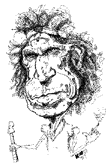
Study # 2 - Hugh Hefner |

Click on any part of the face to go to that section
Review of the vertical guidelines
(actually relationships)
Since we're still early on in the In-depth studies, I'm going to go through a little extra length here reviewing the vertical guidelines of the face before we apply them to Mr. Hefner. You could make the argument that these guides are a little ethnocentric - to think that these Mr. Average relationships are the norm around the world, well that's a little presumptuous. For instance if I was African, not Caucasian American, Mr. Average would look quite different to me...even more so if I was a giraffe or a field mouse or a hippopotamus...or would he? As a starting point, Mr. Average is where I start. Adjust for your corner of the world and by the people you're surrounded by.
Vertical guidelines. Let's kick this off with a quick review. Here's a visual depiction of the vertical guidelines that are pretty much accepted in the drawing world. They've been superimposed over the horizontal guidelines. Gives us a sort of tic-tac-toe look doesn't it?
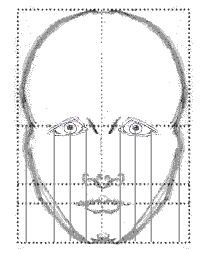
Mr. Average's vertical guides
The basic unit of measure for the face: the eye
I think it was God's intention artists use the eye as the main unit of all facial measurements. Why do I say that? Because within a very high degree of regularity, facial dimensions come to fall within very close proportions - many reducible to terms of eye widths. There are four vertical relations we'll concern ourselves with - and they form the starting points of the vertical guidelines:
1) The space between the eyes is one eye-width wide. From this you can drop a "plumb line" from each eye and you'll see..
2) The width of the base of the nose and it's relation to the inner corners of the eyes is one eye-width wide.
3) The entire breadth of the face: about five eye widths wide.
 |
Good Old Mr. Five Eyes You've heard of "four-eyes"? Well this is five-eyes: he graphically illustrates the "five eye widths" wide span of the face in a front view.
|
The head in a frontal view is roughly 5 eye widths wide. How do we come up with that figure? The eyes are one eye length apart, the there's two eyes, (that's a total of three eye widths so far), and there's roughly two eye widths outside of the eyes - one eye width on each side of the face between the lateral corner of the eye and the widest width of the front view.
|
More proof for the eye-width convention Stereoscopic vision seems to work best with the eyes about one eye-width apart. You can see this in Nature too - especially among predators who's eyes are turned towards the front of the face i.e. facing forward to best "triangulate" on their prey. |
One last guideline. Those first three guides above and the one you're about to see are the big four you need to memorize. Here's the last guideline that doesn't follow the eye-width convention but still uses the eyes:
4) The relation between the pupils and the corners of the mouth. Here it is. The corners of the mouth line up within vertical lines dropped from the centers of the pupils. Which is to say, the average mouth will fit between the pupils - it's as wide as the the two pupils are far apart. And that's about all we'll worry about for now - this is a digression anyways :-)
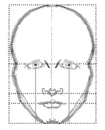
Pupil and mouth relation
So those are the four main width relationships of the face (demarcated by vertical guides), that we're going to consistently focus in on. In the course of a drawing you're actually going to make hundreds or thousand of distinctions and references but these give us a template for placement and exaggeration .
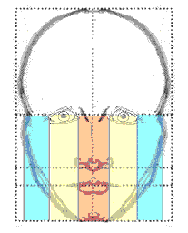
Vertical columns of Mr. Average
The five vertical columns here demonstrate the "lanes"
of the face between the nose and eyes - each an eye width wide. (It ignores the
middle-of-pupil to
corner-of-mouth guide and splits the yellow columns in half).
These guides give you the crux of what to look for. Take a look at the animation again for review - sometimes if you see a graphic demonstration, it'll all come back You can also look at the whole Mr. Average lesson for review.
Take a second
and review this animation:
Click
for animation
Applying the Vertical Guidelines to Mr. Hefner

Lining up the vertical guides between
nose and inner corner of the eyes.
In this clip you can see where the vertical guidelines of
the inner corner of the eyes will fall. What's the verdict? Hef's nose is slightly
wider than the vertical guides. Implication for your drawing? You hereby
have permission to exaggerate the width of the nose if you like.
Note: You can also see a certain amount of asymmetry in the
drawing - look at where the blue lines fall on each side of the nose. The
guide on the right (Hugh's left), doesn't touch the main body of the
bulbous tip the way the blue line on the other side does. Faces have an
asymmetry of their own - and so do artists in their drawings! That's an
advantage to doing the more difficult three quarter view: less mirror
image and less left-side-to-right-side symmetry to worry about.
Next
Applying vertical guides between the center of the pupils to the sides of the mouth - see the yield here? See how the main lines of the mouth slip out passed these lines? Yes, it's subtle, but if you look at the Mr. Average model you can see the main mouth lines stop before you get to the vertical guides.

Lining up the mouth and pupils
Talk about subtle
Now I know this seems nit-picky but it really works! Look
at people around you and you'll see how subtle these distinctions can be.
Watch people as they're sitting closed mouthed and watch them as they
break into a smile. I'm thinking of actress Julia Roberts
right now. Her
mouth looks a little wider than Mr. Average's just sitting still - but
when she smiles - the you have real mouth width breadth. Boom. Now there's something
to explore for both portraiture and exaggeration. (Here's another
really good picture
of Julia)
The need to stretch even in realistic drawing
I remember an art instructor telling the class years and years ago to "always exaggerate the directions, the curves and the angles in the lines you draw. Even when you try to do this, you'll draw them less exaggerated than real life." Pretty true in my experience. So you really have to force yourself to stretch when you're drawing realistically in the beginning. And I think that's why caricature is so fun - you're not just stretching someone else's dimensions, you're stretching your own.
Dropping a "Plumb Line"
Okay let's look at both sets of vertical guides (and they
are vertical), on the
face at the same time. Remember, these are how they would be drawn if we
were drawing them like they ought to be drawn on Mr. Average Face - straight
down as if you were dropping a plumb line. What's a "plumb
line"? It's a weight on a string. Gravity pulls it straight down
literally towards the center of earth. Carpenters and construction workers
use it to make sure the lines they draw on wood or concrete or steel are
dropping vertically. (So in drawing you'd drop the plumb line from the landmarks on the eyes, nose or mouth and
imagine those vertical lines. Then you'd ask yourself "how do they line up?"):

Applying the Vertical Guidelines
Looking at this from a slightly different angle, now ask the question of just exactly how do these vertical guides line up on Hef's face in relation to Hef's face - not Mr. Averages? So, let's just "connect the dots" - go from the landmarks to their endpoints. (The starting point landmarks are the border of the eyes closest to the nose and the center of the pupils, and lines are drawn to their endpoints: you know, to the sides of the nose or to the corners of the mouth). Here's how this will look:

Connecting the dots
Now this gives us some new information. What's it tell us?
Well this was a surprise to me. After seeing both lines (the corner of eye
to side of nose line, and the middle of pupil to edge of mouth line),
I'd never really noticed how much more expansion there was in the eye-to-nose
line in compared to the pupil-to-mouth line. See how much faster the
eye-nose
line opens up as you go from eyes down to the sides of the nose? When I
did the first few exaggerations, I wasn't aware of it consciously at all.
In fact, sitting here typing this and looking at the illustration above, I
thought I missed that proportion until I looked at one of the
exaggerations and I saw this:

Going from inner corner of the eye to the
edge of the nose - lots of expansion
That line just explodes out as you go from the inner corner of the eye out to the edge of the nose. Which made me very happy :-) Now try and visualize the middle of the pupil to the outer edge of the mouth line. You can tell it it's exaggerated but nearly as much.. In fact the line connecting the inner corners of the eyes (the medial canthus), to the side of the nose, is actually actually crossing over the outside corner of the mouth. In the next picture, I'll just add those middle of the pupils to side of mouth lines (in red):

Seeing how corner of eye and nose line up as
well as the middle of pupil to edge of mouth
alignment squares up in the
exaggeration
Again, you can see some asymmetry going from the left to right side of the face. Nothing wrong with that - in fact you'll see in an upcoming lesson how that's part of every face's uniqueness - and cannon fodder for exaggeration.
Reviewing what we've done so far. We looked at drawing vertical lines from two specific landmarks: the inner most corner of the eyes and the middle of the pupils. That's where the lines started - our starting points. The lines we drew the first time were drawn vertically just like they are on Mr. Average. Those vertical lines may or may not have lined up on the subject's face (Hef in this lesson), the same way they do Mr. Average.
The second time through, we drew those lines using the same starting points but we drew them out to designated end points: the side of the nose and the outermost part of the mouth. Both are ways to arrive at one conclusion: what are the proportions of the facial features? What clues can drawing or imagining simple vertical lines give us?
The last Vertical Guideline
We've got one more vertical comparison to look at. And which comparison is that? It's the last lane you can see when you place another eye outside the real eyes of Mr. Average. That's relevant since Mr. Average's head and a face in a front view are about five eye widths wide. Here's the five-eyed version of Mr. Average:
|
|
Here's Mr. Average and his five eyes
And then there's the five-eyed version of Hugh Hefner. What's interesting to note is that Hef's entire face stays pretty much within the rule of "five eye widths wide". Note this though. Look at the width of the face right at the level of the eyes. It's actually the narrowest part of the face (not counting the natural narrowing at the top of the head). So big deal right? What's that tell you? It says proportionality speaking, Hef can be caricatured with a narrowed span at the level of the eyes, or mushroomed out above or below the middle of the eyes. Since the forehead is already somewhat pre-diminished in importance by our brains, we can shrink it and maintain the shape of it and presto!, we have a caricature.

Now you can't go around drawing on people like we're doing here all the time, pencil doesn't write on skin! (Bad joke.) But you can go through magazines and draw on those, right? Newspapers, advertisements, you know, on the ones you're getting ready to toss in the garbage. Just take five minutes and try it. trying this out.
Going deeper
Sometimes when I start thinking about it, it seems like these guidelines don't tell us anything, I mean, so what if you can shrink the forehead and fatten the lower half of the face, does that make this drawing any more recognizable than any other face? And then you think of how many ways people can caricature the same person: one artist gives the subject a huge forehead, and no lower face. Another artist gives the same subject no forehead and a huge lower face and every combination in between and still - you can recognize the person. Any guidelines we lay out so painstakingly start seeming worthless...well, almost worthless. You just know there's more to it than that. It brings us back to the same old question:

What makes a person recognizable?
Some people have props - a cigarette holder, or a feature that's almost a prop (W.C. Fields red nose), Groucho Marx's glasses, cigar and hair part. Farrah Fawcett's big hair and pouty lower lip, Charlie Chaplin and his cane, his mustache and round top hat. Mikhail Gorbachov with his balding head, round face and his birthmark. Salvador Dali and his publicity expression: the pitchfork mustache, buggy eyes and angry mouth. You can almost omit the rest of the face. Draw nothing else and voile! - it's them. Those are the easy ones. Some people we just plain recognize by their props. But there's more to it than that and I'm sure you've sensed that all along.
The artist's greatest accomplishment
Others we recognize because the artist was
observant enough to point out what made the subject unique and the
rest of the world now recognizes a particular drawing as a particular
person because the artist articulated consciously what the rest of us unconsciously
noticed but couldn't put our fingers on. This is in much the same way a
song becomes a hit or makes a story great - the writer or songwriter or author
saw something we all see or saw (or felt) at some level and was able to
put it into a conscious form. He or she was able to articulate it in his/her media, was
able to glean it out for all of us to consciously recognize. And he/she
did it in a way that made us say "that's it!" or "I know
exactly what he/she's talking about". Or you said "of course -
that's obvious". But if the artist hadn't done such a good job,
no one could say so smugly "of course". Does that make
sense? Of course. ;-).
Back to basics
So what do you do when the person you're drawing doesn't have any one thing that really jumps out? Fact is, everybody does - but the "one thing" might be a combination of things. And our work as caricaturist / artist is to find that defining thing or combination of things and take it from there.
Even if exaggeration is not your goal, there's still one bottom line strategy. you can always revert to. And what's that? Simple, patient, attentive observation. That's all. And when you get back into that "beginner's attitude" (like where you were when you were learning the foundation lessons), it start's to happen all over again. Things come to you you hadn't noticed before. You're the conduit between what's out there in the world and what comes out of you and on your paper.
Back to faces
Ok. You're back into that pure observer perspective. Where do you direct that? There's all sorts of things you can look at. but I think there's two that make for grabbing, really nailing a caricature. And it's these two things:
-
Signature expression;
-
What are the particulars of a signature expression?
Signature expression. What's a signature expression of a person? It's a position or a pose you just always seem to catch them in. A person who's constantly stressed, well they have a signature look. A person who's stoned all the time - a different look. Of course, when you're drawing at gig, you don't have much time to get to know their signature look. It's something to be aware of in the people you're around all the time first. Then try guessing when you meet new people.
What are the particulars? Identifying what it is in those signature expressions, what's unique, that's the trick. In drawing terms it's all about the specifics in terms of lines, shadows, contours, highlights, proportion, etc. It's pinpointing exactly where and how this person's essence is expressed in capturable data. I know, sounds pretty clinical. If you can see it, it's there. And that takes us to the third part of this in-depth exploration : looking at Hef's features one at a time in Part III.
Kasbohm & Company's
YouCanDraw.com
Copyright, All rights reserved 1997-2001
e-mail: jeffkaz@YouCanDraw