The Supply Store
Back to YouCanDraw .Com
Case Study
# 1: |
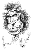
In this section, Part III of Case Study #1, we're going to look at two things: first we'll , reconstruct the different volumes of the face using the "Blockhead" approach. Then we'll compare Mr. Richards to Mr. Average regarding the horizontal placement of the middle of the eye line, the base of the nose line and the middle of the mouth line.
Click here for Part I
Click
here for Part II
Click
here for Part IV

Web picture references:
Directions (if not already highlighted):
|
Applying the "Blockhead approach to Mr. Richards
As you build your repertoire of evaluation tools and methods, don't forget about the basics - the very basics - like Mr. Johnny Average face. Look at each feature, understand each in relation to what you know about the anatomy of each individual feature. Then look at the overall layout of the face and head. We'll be applying the same sequence you saw used in the foundation lessons.
I'm going to stumble through the steps I went through to arrive at a 3-d outline or "matrix". I used this to get the full feel of Mr. Richards' face and head. I'll put in the most relevant pictures. (I know this is a fairly advanced example to start off with. I'll have simpler ones included in upcoming case studies.)
Mr. Average face revisited.

Quick Blockhead Sketch of Mr. Richards
The above was my first attempt at trying to get a feel for the bony structure, for fitting them together. It didn't work too good, but it's a good review of the "blockhead" parts. (In the blockhead approach, remember we're trying to chisel down a cube to it's most essential parts: the forehead, the cheekbones, the mouth and maxilla, the lower jaw. The nose is added later.)
So since this wasn't a real great start, I tried sketching the head a few more times. It's not so much that I'm trying to get a likeness as I'm trying to get a feel for the volumes of the face and head.
Next try
Here's a view that captures volume better than the one above. If I squint my eyes and scroll between this view and the caricature at the top, the volumes are starting to make sense. There's' something around the eyes' and eyebrows that isn't quite right though. I haven't quite nailed down what it is but overall I'm closing in in it.

Forming up the blocks that make up the head and face
| Note
how I've lined up everything along a central line
- a "Greenwich" line - going north and
south- that is, a line down the center of the
face. (It's the midline contour - this same line
as the vertical line that divides the face into
left and right halves.) I've also added and an "equator" around the mouth and at the "base of the nose line" to suggest volume again. Simple contour lines bring out volume in all sorts of ways. Makes Keith look like he's smiling in the next picture. |
 |
Here, the very next picture below, I've added a nose for volume's sake. Imagine the "Greenwich" line (or midline contour) as it courses over the topography of the face: it bulges at the forehead, recesses between the eyes, is the foundation behind the nose (the nose courses over it), it bulges out with the first 2/3'rds of the mouth and pulls back again at the chin.

Adding a nose
Further, I've roughly started filling in the area where the eyes will go. And now I see where I went wrong with the cube around the eyes - the eyes are surrounded in an almost figure of eight kind of shape. But now I've lost some of the volume around the mouth.
In this next picture I've got the volume back around the mouth and I think I'm solving the problem with the bones around the eyes - even though the shape around the eyes is crooked. (See it doesn't have to be perfect folks, we're just exploring here.) There're two arches in the eye area that are stand-ins for the eye brows. The nose has been left off, but that's ok, I know from the picture above where it goes.

Getting the volume back in the Mouth
It's starting to come together
 Getting the pieces to fit |
Now
I'm getting the feel here, it still looks a
little weird, but again the litmus test is
looking back and forth - squinting - between the
original above and asking "is this the right
shape?" and I think it is. At least
I'm confident I can capture it in another
picture. Just so you don't get discouraged, I want to tell you this: all artists go through layers and layers of preliminary drawings when they're doing a big commission. The detail we're going through here builds the foundation for all future quick party sketches or for the really detailed jobs. |
Now that we're getting a little feel for the volumes and shape of the head, we still need to ask this basic question: where do the features go? And that's where Mr. Average Face comes back into the picture.
Where do the features go? Time to apply Mr. Average Face
In the next set of illustrations, we're going to be applying the Mr. Average Face grid to the outline we've developed. The grid is comprised of the outlining format, (the rectangle that bounds the whole picture) a vertical center line, and three horizontal dividers. The horizontal dividers correspond to the:
eyeline
the base of the nose line, and
the lip line.
(You've seen all the "grid work" stuff before in Lesson 14, and specifically in Part VI of that Lesson.) In this next picture, the black lines correspond to the different horizontal markers:

Comparing "Mr. Average" grid proportions to a Mr. Richards "rough sketch".
Line 5 connects the horizontal top line of the format, Line 4 connects the horizontal bottom line. Lines 1,2, and 3 are lines we mentioned just above: the eye line, the base of the nose line and the lip line respectively.
Had the grid drawing we did of Mr. Richards been exactly proportionate to Mr. Average, then all these lines would be parallel (or at least the distance between them would have been proportionate). They're pretty close in size and that makes the two comparable. Let's look a little closer.
Looking at line 1: the Eye Line
In the Mr. Average grid, (the face on the left), the eye line, (line 1) cuts the grid in half horizontally, right? But look at where line 1 in the Richards grid is placed - it cuts across at about the top one fifth of the grid - the distance between line 5 and line 1. Since the two pictures (average face and the rough sketch) are roughly the same size, the proportions should be pretty close - but then only if they're both "Average Faces".

Comparing distances between the
eyeline and
top of
the picture - that is, between lines 5 and 1.
The original "realistic" caricature at the very top of this page seems less distorted than this - but breaking it down with a grid will allow you to see that the rough sketch is actually pretty accurate. Applying a grid - real or imagined - gives you insight right into the most complicated and interesting faces - you'll discover a large part of what makes them all so unique.)
Of course you might be objecting right now: "well Jeff, you cheated, you didn't start with a real photo to begin with". You're right about that in this case study. But I think taking an already exaggerated picture and exaggerating it even more - and keeping a true likeness involves the exact same process. (The caricature at the top of the page was drawn from a photo.) Stay with me now...
Looking at line 2: the Bottom of the Nose line
The bottom of the nose line in the Average Face grid, (line 2), is about 3/4ths the way down the entire grid. (Though recall, the new bottom of the nose line is 2/5ths the way down the distance between the eye line and the bottom of the chin line - line 4. For easy recall we used the 3/4ths measure in the original section in part VI of Lesson 14.)

On the Mr. Richards side of the picture, (the right), the bottom of the nose line, (line 2), is the horizontal center of the picture. The horizontal center in a Mr. Average Face grid is what? (If you said eye line, you're absolutely right!)
If you were going to exaggerate this part of the face, first you'd need to compare it to the overall picture. Where does this interval, line 1 to line 2, fall in the order of distortion when compared to Mr. Average? It's larger than the interval from line 5 to line 1, so you could make it bigger proportionately, but it's exaggerated by a much smaller degree than the distance from line 2 to line 3. Compared to Mr. Average, this interval, line 1 to line 2, is about the same size and proportion. I'd probably leave it alone - that is, I'd go for realistic dimensions in this part of the face.
When you're comparing distances between the horizontal markers, don't forget you're computing a ratio in comparison to Mr. Average: "the distance between the base of the nose line and the middle of the mouth line on the Richards sketch is proportionately twice as big as the same distance in the Mr. Average face". And this is done without even thinking about what the individual features look like - just purely straight line lengths and widths.
My rule: Go for the most exaggeratable parts or distances first. You could draw this section of the face realistically and exaggerate the more obviously distortable parts and pull off a great likeness. But we're not through yet.
A closer look at line 3: the middle of the mouth line
Line 3 demarcates the middle of the mouth. In an "Average Face" it also marks off one third the distance between the bottom of the nose line and the bottom of the chin. In our rough sketch this distance (from bottom of the nose to bottom of chin) is much less than the "Mr. Average" distance, but that's a different comparison.

Comparing the area between the bottom
of nose line
and the middle of mouth line.
In our rough sketch here, the middle of the mouth line marks off the picture down to approximately the last fourth or fifth of the entire front plane. The anatomy around line 3 however, (the nasal philtrum, the fleshy "curtain" area above the upper lip and below the cheeks, and the lower lip), is a very caricaturable area in my opinion. This distance between line 2 and line 3 encompasses the largest single mass of Mr. Richards' face, (the area of and around the mouth). So, I'll choose to go "hog wild" there.

Area of greatest exaggeration:
from the bottom
of the nose line to the middle
of the mouth line
Even though the horizontal lines mark off facial feature landmarks - like you see the highlighted area in the illustration just above - it just doesn't capture everything.

Looking behind the horizontal lines
We could get really intricate here and build a better analyzing tool, like a "Mr. Average Proportion Table" for all the bony masses of the face - but we'd never get past page one. That's something you can pursue as you like. (Though I'll try to build table like that in future versions. Great artists have done exactly this...er, not that I'm a great artist, but consciously or unconsciously, that that's how deep into detail the greats got in both fine art and caricature.)
A grid with horizontal lines is an excellent way to start. You'll build layers and layers into your own mental /observational tool kit as you do more and more drawings and caricatures.
From middle of mouth to chin
In the last section, from middle of mouth line to the bottom of chin, we're dealing with an area not too overly exaggerated when compared with Mr. Average:

Comparing the area between
middle of mouth
and bottom of chin
If we concentrate on the area above the chin, stretching it, it'll be more humorous if you allow the chin to shrink some - and this will only amplify the already exaggerated mouth.
Order of exaggeration
In order of greatest exaggeration, the area between top of the head and the middle of the eye line, (basically the forehead), is the area most shrunk, while the greatest size stretch is in the area between the bottom of the nose and the bottom of the chin.
Since most people don't even see the forehead, (as evidenced in early drawings by artists - they just plain forget to include a forehead in their drawings, and the brain normally doesn't use it in recognition), it's clear to me the mass I'd choose to exaggerate most: the mouth and facial features. The ones supported by the maxilla (the bone behind the nose, upper jaw and below the cheekbones.)
This was a pretty drawn out way of getting to what you'll eventually be doing intuitively, but I hope it gives you an idea of the analysis caricaturists perform - consciously and unconsciously.
The beauty of a grid
The beauty of the grid is this: we now have some kind of reference that urges and allows us to telescope or microscope in any direction. If a feature falls on the "average face grid" along any of it's guidelines in disproportion, then guess what? You get to exploit it - that is, you get to exaggerate it. But we're not done yet!
Click
here for Part IV, the final part -
and see it all come together
Kasbohm & Company's
YouCanDraw.com
© Copyright, All rights reserved 1997
e-mail: jeffkaz@YouCanDraw