|
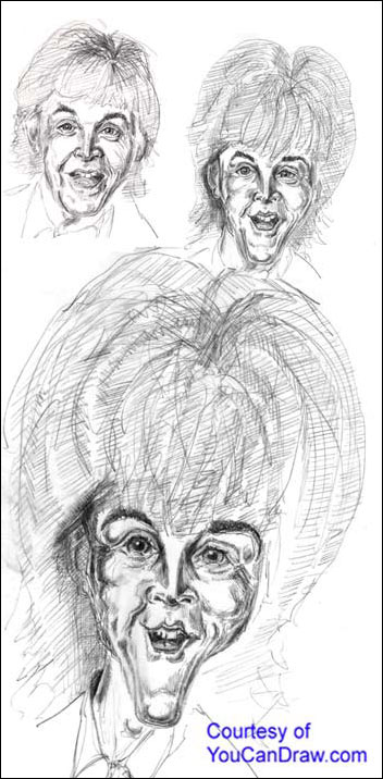
May 10th 2001 (picture at bottom) ************************************************************* Your Every Other Week Caricature Complements of YouCanDraw.com ************************************************************* Hi all, This week is the finished version of Paul McCartney. I brought it to my neighbor and I asked him point blank "who is this?" And he said without flinching "Oh, I know just who that is, that's Paul McCartney". Brought it to my other neighbor, same thing, "That's that Beatles guy - Paul, Paul Mc, McCartney". Showed it to one of the neighbor's kids and he just shrugged his shoulders. "Snoop Dogg". Then took off on his skateboard. I was a little dumbfounded - happy, but dumbfounded. This drawing quite frankly isn't working for me, but it passed the litmus test - someone, out of the blue could recognize it. Maybe I'm just getting hypercritical in my old age :-) . Now I could go back and redraw and redraw and I know I'd nail the look, but I put on a timer (20 minutes this time) and I stick pretty close to it. By answering the timer I don't give myself a million and one excuses to delay drawing. (It's been pretty busy around here.) And I'm learning all over again to just accept what comes out. I've said this before many times: rarely does a drawing (or painting, or a song for that matter), come out the way you planned it would. But the trick is to just be open to what happens and move on. You can always take a break, go back, and take as many stabs at it as you like. Where I see problems in this drawing Where I do think this drawing lost it's resemblance ? The first place is the eyes - when you draw from a drawing, things that are slightly off in the drawing may get a little more off in the successive drawing. After I drew it I pulled out the original photograph and realized Paul's upper lids droop just a little over his eyes. The upper lids in the final arch just a little too high. (Isn't it amazing how such a minuscule adjustment can change the overall look?) The remedy? Cover a little more of the iris (the round colored part that's around the pupil). Slant the upper lids down at a steeper angle from their high- est part and make the highest part of the lid at a point closer to the nose. Over all I like the eyes though - they're fairly realistic. By Arching the eyelids too high, I over arched the eyebrows too making him look younger and more feminine than he is. The nose works - it's largely unchanged. The mouth: I tried narrowing it some from last issues' version. There's a re- semblance but the smaller tongue takes a away little from the overall jubilant expression (you have to look into the picture to see this). I think I could have gotten mean about the teeth and the results would have been pretty hilarious, but I didn't do that. The last major change was lengthening and narrowing the chin and jaw. I'm not sure if that's the look I wanted - but I was experimenting, and that's always a healthy thing in drawing. The overall shape of the head has been left unchanged as was the shape of the hair - except I gave him BIG hair (and then I got lazy and said "who wants to cross-hatch all THAT?" - the original is a full foot tall.) So, there it is folks. See you can even learn a thing or two when you don't have a "total" success. Dive on in, don't be afraid and ... Keep on drawing! Warmly, Jeff K. PS - if it's been close to a year since you signed on, watch for the upcoming offer in the next day or two - I think you'll see it's very much worth your while :-)
Executive Director http://www.YouCanDraw.com "Once and for all getting you drawing faces and caricatures" mailto:comments@youcandraw.com
|