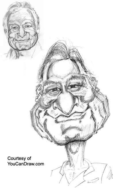
| 8 June 2000 Final of Hugh Hefner
Hi Everybody!
Here's the latest: It's the final of Hugh Hefner. Now
before you look
I got to tell you I just didn't have enough time this
week to ink this one
up. So, since that's part of the deal, I'll compensate by
loading this up at
the Art Gallery as a 150 dpi - versus the usual 72
dpi picture. (That might only sound like 2 times bigger
but it works out to
about 10 times the digital information - it'll print out
with a lot more
resolution.
What's different in the final
What's different? Check out the last Hugh in the archives
or in the
Art Gallery and I think the progression will be clear.
I'll list feature by
feature what I did in comparison to the original. (See
the realistic sketch
in the upper left hand corner.)
1) Shape of the head: I tried to
maintain a sense of a broad forehead by
keeping it domed - i.e. rounded at it's edges. Overall, I
really exaggerated
what I perceived as a "pear-shape". (You might
choose square and get 10
times more hilarious results.)
2) The hair: Maintained the
"wispy" thinning look by keeping lots of
highlights - especially where the hair meets the edges of
the forehead. Lots
of thin stragglers on the top of the head. Didn't quite
maintain the
highlight nor the receding line at the hair's
"part".
3) Eyes and eyebrows: I kept these
fairly realistic but enlarged the dark of
the eyes (makes them friendlier), and made them closer
together. (Recall
eyes are proportionately one eye-width a part in an
"average" face.
"Sight" - that is measure how wide the eyes are
apart in terms of
eyewidth (like a half or 2/3rds of an eyewidth). The
shape of the eyelids
and the folds under the eyes stayed virtually unchanged.
4) The nose: I forgot to mention in the
original progression series e-mail
how much filling of the nose I added - er, broadening of
the main body
(the middle section) I worked in. Hef's got this slightly
spoon-shaped nose
with a deep "v" at it's base. I played that up
quite a bit. You can also see
I put the very tip of the nose almost into the upper lip
- right on top
of "Cupid's Bow".
5) Cheekbones: just made them a little
rounder with sharp, angular edges.
Hef also has this small bridge of cheek that spans the
little space between
the nose and the main round part of the cheek - makes the
cheeks look like
"9"'s.
6) The mouth: really played up the flat
"W" shape of the mouth and the
triangular shadows at the corners of the mouth - adds
just a wink of "smirk"
to the expression.
7) Cheeks/jowls/jaw: as you can see,
blew 'em right out of the water.
Kept strong and sharp angles at all the curves. This
keeps him from
looking fat.
8) Chin: Mirrored the original shape and
shadowing, just hyped it out (made
it bigger).
9) Neck: longer and skinnier. (That's a
pattern I definitely use often.)
10) Clothes: just used the typical
bathrobe Hef sports in most of his
press releases.
So until next time, keep on drawing, send any questions,
requests, and if
you feel really strong about getting the inked version,
let me know. (If I
get in a another time crunch, the pencil drawings pop out
10 times faster!)
Warmly,
Jeff k.
Here's Hugh:
Kasbohm
& Company's
YouCanDraw.com
© Copyright, All rights
reserved 1997
e-mail: jeffkaz@YouCanDraw
|